Contents
Intro #
In the past few days, I've been working hard on this blog, and I think I'm happy with how it's turned out. It is still lacking in terms of content but that is not an issue, as I will update it whenever I begin a new project or feel the need to share a part of my web development journey. Therefore, I think I am ready to start on another project while maintaining this site and making changes whenever I feel like something could be implemented better. I will talk more about changes that could be made later on.
Recent changes #
Firstly, I would like to highlight the main changes that I have made to the site. Some of the main changes include:
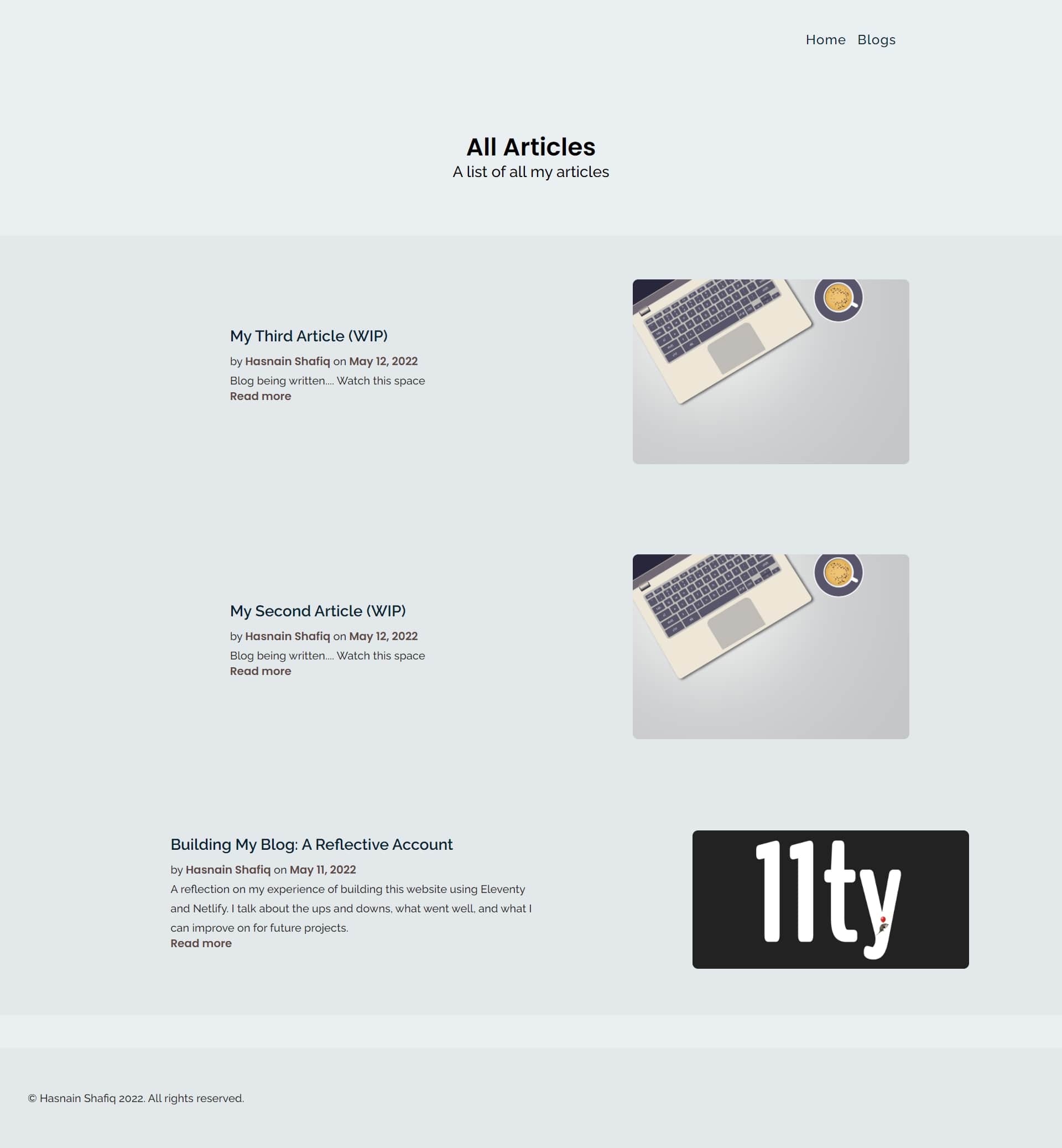
- adding colour to the site as can be seen in the navigation links, the logo, the footer, and along the side of the blog cards.
- including my email in the footer in case anyone wants to leave feedback or just say hello.
- small changes to the layout of the main body of text in the blog posts.

I am really pleased with the appearance of the site now. It was only after adding colour that I realised how bland it initially looked. Previously, the blog was lacking colours which made it look uninviting and boring. Now, it looks lively and it has a cheerful personality. All I did was use a colour picker to select a colour from the SVG, which is seen on the home page when viewed on larger screen sizes, and add it to different elements. Beyond black, white, and the colour seen in the nav links and footer, there are no other colours on this site, with the exception of different shades of those three colours.
One thing which I changed quite drastically whose effects cannot be seen visually is the CSS. Admittedly, it was rough around the edges with bits of repeated code in some of the stylesheets. I was especially irritated at the fact that the CSS for the navigation bar and footer was included in all stylesheets. As I mentioned in my previous blog post, I sometimes rushed the development which meant that I was not following best practices. Of course, hindsight is always 20/20 and I now know that I will avoid allowing my impatience to get the better of me. In the moment, it felt like progress was sped up and I was getting closer to deployment but, in reality, I just created more work for my future self.
As a result, I spent a considerable amount of my time cleaning up the CSS and structuring it more logically by using comments to signpost to each section within the stylesheet. Additionally, I removed all the stylings for the nav and footer and stored it in a global.css file which I linked to in the head above the specific stylings for each page. This meant that the global stylings were applied across all pages first before the specific stylings were applied. Global stylings were to do with typography, colours, and recurring elements such as the nav and footer. Page-specific stylings were mainly to do with the layouts of the elements using media queries.
Improvements for future #
There is still work to be done, but I am happy enough with how the site currently is to choose a new project to set my sights on. The main improvements which I have made note of are:
- Using the
picturetag to increase site performance. # - Adding tag filtering. #
- Integrating Cloudinary. #
Using the picture tag #
I haven't optimised images using the picture tag to serve images at smaller sizes on smaller devices. This is something which I did try to implement but, at the moment, it seems to be more of a hassle than it's worth, given that my site is still small and doesn't use loads of images. The biggest issue I am facing is that the images in the 'featured articles' section on the home page and on the cards on the 'blogs' page are taken from the front matter. For example, on the blogs page, I loop over all of my blog posts in the following way:
blog.njk

{%- for post in collections.post | reverse -%}

  {% include "blog-snippet.njk" %}

{%- endfor -%}
Essentially, each blog (or 'post' as it is named in the above code) is a markdown file with front matter containing the data for each blog, including the main image which is displayed at the start of each article. Using Nunjucks, I loop over each blog post and the images are added from the blog markdown files dynamically. For example, the front matter for this blog article has an image key whose value is /assets/img/update1.jpg. Therefore, in blog-snippet.njk which creates a base card layout for each blog post, the following code takes the image src from the front matter of each blog and inserts it in place of post.data.image:
blog-snippet.njk

<li class="blog">

<div class="img-container">

<a href="{{ post.url }}">

<img src="{{ post.data.image }}" alt="{{ post.data.imageAlt }}" srcset="">

</a>

</div>
.
.
.
</li>
The issue I am facing is how to set the image src in the front matter for each blog post and use a picture element to load up the correct size image at each media query.
However, I probably can use the picture tag in the article body to optimise any images used in my articles, so that is something to consider the next time I make changes to my site.
Adding tag filtering #
Something which should be relatively simple, in the next set of changes I make, I need to add tag filtering so that visitors are able to filter through my posts using the relevant tags.
Integrating Cloudinary #
Using a CDN will help me optimise my images and increase site performance. I'm not sure if it will help me solve the issue regarding images taken from front matter not being optimised and sized appropriately for each screen size, but that is something else which I will look into integrating.
Concluding remarks #
Hopefully you can see the work that has been done in the past few days. I am proud of the progress that has been made, even if it may be a little. The site can be improved massively but, at the moment, I am happy with it and think that I am now ready to move on to another project. I will keep you all updated on my next project, so expect more activity on this site in the coming days.
